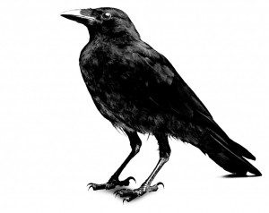
Contact Corvus Communications Via Email
Call us at 916.296.6989


PAST CLIENTS/WORK
LOUNGE ON20
COSMO CAFE
CORV.US
SUSAN G. KOMEN
THE VINE
BITECLUB
THE BLOCK
KWOD 106.5
PHREEK INDUSTRIES
NEPHESH
SPRING CREEK POOLS
F.U.E.L ENERGY
PHREEK FIGHT
GOLDEN VOICE
DAGORED
CORVUS PHOTOGRAPHY

 
LOUNGE ON20
WEB

Corvus was commissioned to conceptualize and Art Direct the website for Midtown Sacramento’s newest swanky digs, Lounge ON20. Using their existing logo and color palette, Corvus created a sexy, ultra sophistication vibe by using a combination of vibrant, bold photography coupled with simple typography that entices you to “see yourself there”. Several concepts were developed and yet to be officially launched by the Lounge ON20 marketing team.

View Layouts

      MAIN MENU   NEXT >>
 
COSMO CAFE
IDENTITY

“The Cosmopolitan” project is the newest of the emerging and developing theater district on historic K Street in downtown Sacramento. Randy Paragary’s newest venture, Cosmo Café, is one part of this newly minted district. Corvus created logo concepts based on retro typography and architectural details found inside and outside the café.

View Sample>>

  << PREVIOUS   MAIN MENU   NEXT >>


CORV.US
IDENTITY

We only had a few things in mind when creating our own identity. Clean, unique, and one color. Part of it was economics and part of it was our own self imposed design challenge. Can we create something compelling with forced limited options? Yes we can. The best part? Watching people react to our business cards...do you get a double take with your cards? No? Call us.

<<View Identity>>

  << PREVIOUS MAIN MENU   NEXT >>


KOMEN RACE
PRINT

Corvus worked with the local chapter of the Susan G. Komen Foundation and Race for the Cure. Our challenge was to create unique promotional posters featuring stories of local survivors. Corvus conceptualized and created these promotional pieces including all companion photography for the pre and post event press use and Komen website.


<<View Samples>>

  << PREVIOUS   MAIN MENU   NEXT >>
 
THE VINE
PRINT

Bridges Restaurant in Danville, CA chose Corvus to assist in branding it’s newest expansion to include a new wine bar and lounge. Everything from the paper choice to the logo mark and color palette was designed to complement this speculator facility. Random client fun fact: Bridges Restaurant was prominently featured in the film “Mrs. Doubtfire” starring Robin Williams...they always bring that up.

View Identity

  << PREVIOUS   MAIN MENU   NEXT >>
 
BITE CLUB
PROMO

“It’s like the MySpace for the restaurant industry” was uttered so many times that we lost count! Corvus helped social network Web 2.0 startup BiteClub.com create and scale online advertising and site sponsorship opportunities. Corvus also traveled to various trade-shows coordinating grassroot awareness and participating in live blogging promotions including the Restaurant and Bar Industry Trade Show in Las Vegas.

<< PREVIOUS MAIN MENU   NEXT >>


THE BLOC
IDENTITY

Corvus was commissioned the challenging task of naming an entire area of midtown Sacramento. One square block of restaurants and nightlife needed a “name”. After several sketches, concepts and crazy, esoteric names, Corvus went simple and straight to the point with “The Bloc”. This official logo of an unofficial area appears on event posters, invitations, websites, and any companion collateral when referencing this area and it’s commercial residents.

  << PREVIOUS   MAIN MENU   NEXT >>


KWOD 106.5
MERCH

Ever get a “promo shirt” from a radio station? Bad colors, poor quality, GIANT logos. It’s about as exciting as the free candy banks give away. Local alternative radio station KWOD relies on Corvus to create clothing listeners will actually wear...and not just to change the oil in their cars.

View Designs

  << PREVIOUS   MAIN MENU   NEXT >>


PHREEK IND.
PROMO

Corvus was commissioned to conceptualize and Art Direct the website for Midtown Sacramento’s newest swanky digs, Lounge ON20. Using their existing logo and color palette, Corvus created a sexy, ultra sophistication vibe by using a combination of vibrant, bold photography coupled with simple typography that entices you to “see yourself there”. Several concepts were developed and yet to be officially launched by the Lounge ON20 marketing team.

<<View Layouts>>

<< PREVIOUS MAIN MENU   NEXT >>


PHREEK IND.
MERCH

Phreek Industries is the sister organization to Corvus. Founded in 2000, Phreek Industries was founded by two friends who decided “work” was a relative term. Phreek remains a strong and innovative clothing label in a crowded marketplace. Phreek is also proof positive that Corvus’ innovative and creative strategies that work in real time. This is where we walk the walk and talk the talk.

View Samples

  << PREVIOUS   MAIN MENU   NEXT >>


PHREEK IND.
PRINT

Phreek Industries promotional posters and full page ads for both the US and Australian markets. All photography, art direction, local scouting, and design production done in house.

View Ads

  << PREVIOUS   MAIN MENU   NEXT >>


PHREEK AU
IDENTITY

Phreek Industries promotional posters and full page ads for both the US and Australian markets. All photography, art direction, local scouting, and design production done in house. This is where knowing the difference between letter and A4 come into play. California lifestyle by way of the Gold Coast!

View Ad

  << PREVIOUS   MAIN MENU   NEXT >>


NEPHESH
IDENTITY

Husband and wife team Kit and Audrey Langstroth wanted a unique name and identity to match their unique vision for health and wellness. Corvus built the identity from scratch based on concentric circles and your five senses among other esoteric and subliminal nuances. Everything from the paper selection to custom build die and finishing was carefully chosen to complement all other components.

<< PREVIOUS MAIN MENU   NEXT >>


NEPHESH
IDENTITY

Simple and clean with a complementary color palette that says reeeeeelaaaaaax...Corvus built a simple web interface mixed with stock and custom photography.

www.nepheshonline.com

  << PREVIOUS   MAIN MENU   NEXT >>


NEPHESH
CONSULT

he word “Nephesh” is translated from the traditional Hebrew word for “soul”. Husband and wife team Kit and Audrey Langstroth wanted a unique name and identity to match their unique vision for health and wellness. Corvus started with this unique take on naming through research and creative thinking and followed through with everything from the paint on the walls to the interior and exterior signage. This overall “vibe” was then spilled onto the website and all printed materials.

  << PREVIOUS   MAIN MENU   NEXT >>


SPRING CREEK
PHOTOS

Not everyone can afford this type of luxury in their own back yard. For those who can, they call Spring Creek. When Spring Creek needs photography, they call Corvus. All photography was designed to be used in everything from printed materials to advertising and was shot “magazine” style...if that makes any sense to anyone other than us.

View More Photos

  << PREVIOUS   MAIN MENU   NEXT >>


FUEL ENERGY
WEB

If you want to go after the big boys of the billion dollar energy drink market...you better come out swinging. In the case of Fuel Energy Beverage...Corvus helped them come out swinging... with an old lady? She is a BA-OL! This viral style opening was the splash page to their forthcoming website. There was a lot of back and fourth with the client and several versions created. Which one is your favorite? MORE FUEL!

View Web Intro

  << PREVIOUS   MAIN MENU   NEXT >>


PHREEK FIGHT
WEB

Phreek Industries and MMA com together in this specialty label of the heritage brand. MMA is one of the fastest growing sports in the world and Phreek Fight has been there from the very beginning. PhreekFight.com was designed as a showcase for sponsorship involvement, the fighters themselves, the statistics, and the clothing that supports the sport.

www.phreekfight.com

  << PREVIOUS MAIN MENU   NEXT >>


GOLDEN VOICE
PROMO

Corvus offers up our extensive extreme sports, youth market, and special event marketing and promotions experience to you via experiential marketing and promotions. If you know what street team means; call us and we will execute. If you don’t know what street team means; call us and we will explain it to you. Then show you how it can effectively work for you.

Goldenvoice knows what street team means. You should too.

View Photos

<< PREVIOUS MAIN MENU   NEXT >>


7 3 1 6
DAGORED
MERCH

Getting a chance to work with World Record holders doesn’t come everyday. When the team behind Dago Red contacted us to redo an entire identity and new companion merchandise for this iconic aircraft team, what else could we say but yes! Corvus refreshed the logo by adding the iconic P-51 aircraft shape and mixing it with modern type and a “retro-modern” color palette that was carried into the merchandise and website.

View Samples

  << PREVIOUS   MAIN MENU   NEXT >>
5 4
2


CORV.US
PHOTOS

We offer our unique and creative perspective to all photography assignments. We can shoot your project start to finish including pre and post production or assist your photography team with vision and management. On location or at in our in-house studio, we are available for all your visual work. Need headshots? Check. Need a full print campaign with a unique eye? Check. Medium format digital? Che...wait, what’s your budget again? 

View Samples

  << PREVIOUS   MAIN MENU   NEXT >>


CORV.US
PHOTOS

We offer our unique and creative perspective to all photography assignments. We can shoot your project start to finish including pre and post production or assist your photography team with vision and management. On location or at in our in-house studio, we are available for all your visual work. Need headshots? Check. Need a full print campaign with a unique eye? Check. Medium format digital? Che...wait, what’s your budget again? 

View Samples

<< PREVIOUS MAIN MENU CONTACT CORV.US